
RESPONSIVE IMAGES – ART DIRECTION
Responsiveness is probably one of the most requested – and possibly the least understood – function for a website. With more people now accessing the web via their mobile devices than by laptop, it’s no wonder that it viewed as important. Google has made it clear that it takes responsiveness very seriously.
But what is responsiveness?
At it’s most basic, it simply means that as the size of the screen used to view the content gets smaller, so does the content. Images are resized to make page loading faster. Content that would appear alongside its neighbour on a large laptop screen shown above its right-hand neighbour or below its left-hand counterpart. Everything fits nicely on the screen and the mobile user can enjoy browsing the website.
At this level, most, if not all, modern themes are responsive by design. But that’s not the whole story. This is the first of a two-part article about responsiveness in WordPress.
Smaller is not the complete story
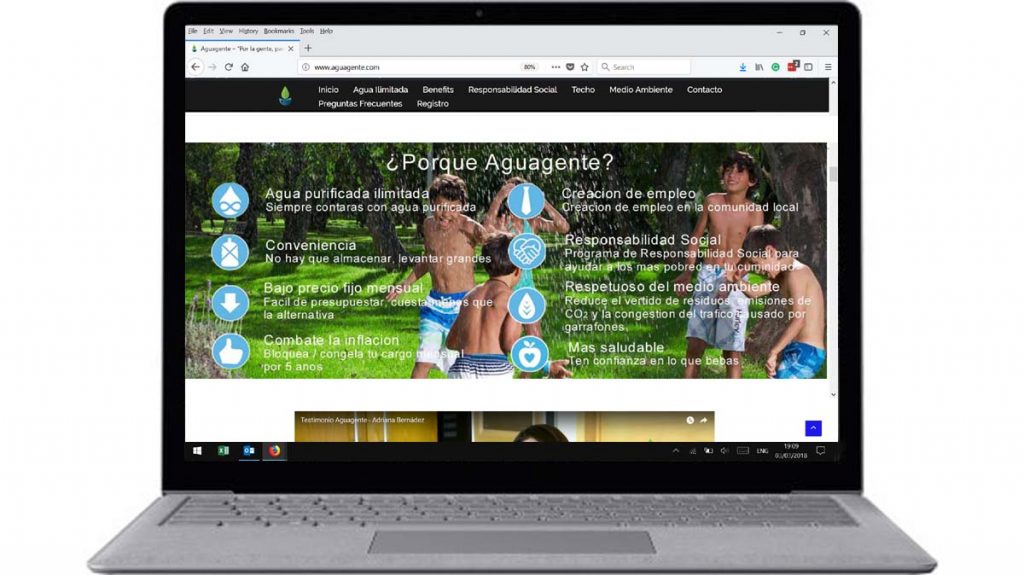
There are several situations where this simple approach fails. Have a look at this image as it appears on a laptop. Easy to see and perfectly legible:
Now look at the same image as displayed on a mobile device (an iPhone 6). The theme has ‘correctly’ resized the image to fit on the screen. But in doing so, it has made the text on the image unreadable to all but the most eagle-eyed visitors.
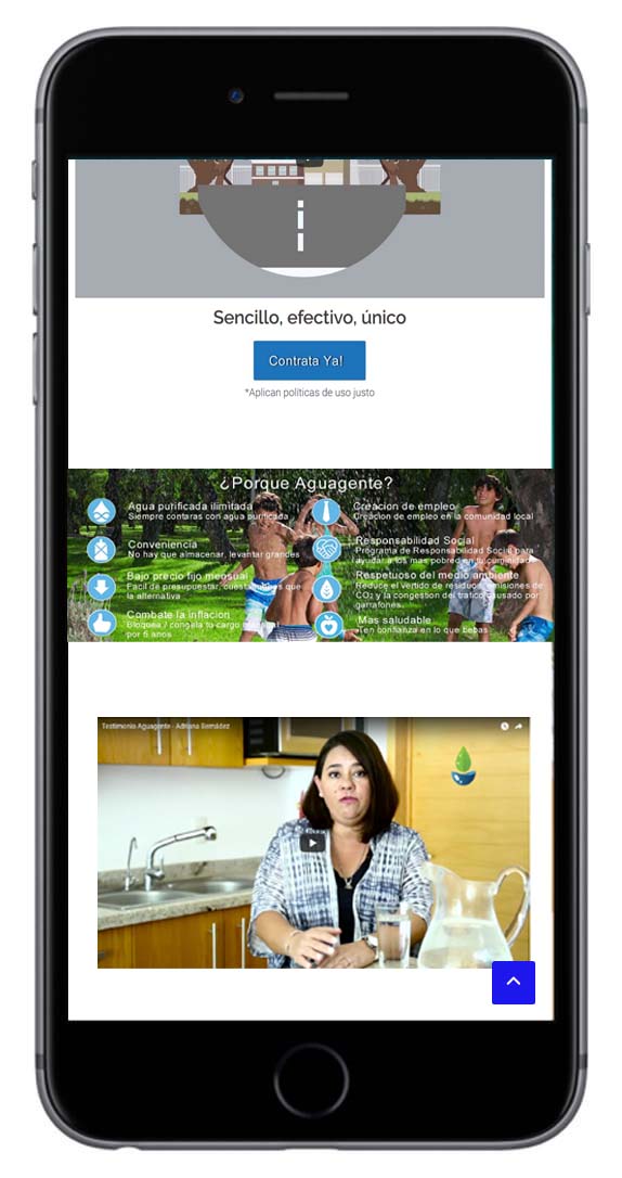
Although the theme has done what is what designed to do, the image fails. More is needed but it can’t be achieved automatically.
This human intervention required is often called artist direction. The developer, in conjunction with the website owner or designer, will decide what needs to be emphasized within an image and at what size screen that emphasis is lost. At the appropriate size, the original image is replaced by a different one. There are various tools available to determine what size screen the website is being viewed on.
The quickest way to check how a page will work at different sizes is to partially minimize the page and slide the mouse to the left to make the page even smaller. You will see how the elements rearrange themselves to remain visible as the screen size shrinks. This is only a rough guide and does not show exactly how a website will work on different devices.
In Firefox and Chrome, there are web tools that can mimic responsiveness more accurately.
An Example
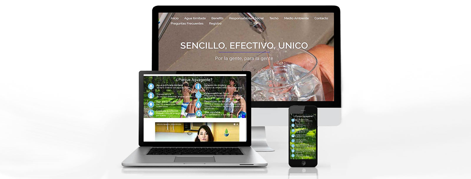
The client had an image with text that was designed to explain certain features of their product range. The theme was responsive but all that meant was the image shrank as the device screen became smaller.
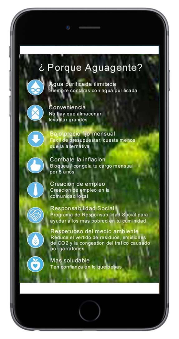
To enable users on mobile devices to still get the important information, I set up two images using the art direction concept, based on the screen size. On large screen the image was horizontal but on a smaller screen, it was automatically replaced by a vertical version.
Check out the site at: http://www.aguagente.com
There is a lot more to having a responsive website than images. Problems can arise when elements are automatically sequenced by the theme but not in the order the designer wanted. Also, when customising font sizes and even paddings or margins, some developers take the easy route and use px as the measurement. This is normally ok but can lead to unexpected results. We’ll explore both of these in another blog.
In the meantime, if you want help with making your website really responsive, please contact us.